What is Data Visualization?
More than just making numbers look pretty, data visualization is the graphical representation of information. Graphs, charts, maps, and tables are powerful communication tools, helping to make data more accessible.
Good data visualization helps you to unlock new insights, monitor your KPIs, understand user behaviour, and effectively communicate data with non-tech teammates. It’s also a very powerful tool for sales, marketing, and for sharing information with stakeholders.
Why is Data Visualization important for Product Managers?
As a Product Manager, you may be working in partnership with a Product Ops Manager on data visualization. Certainly, they’ll be the person with the best tool recommendations! But it’s always good to have a least a basic understanding of what platforms are out there.
In a smaller company or a startup, you’ll probably find data visualization falling into your lap.
We’ve talked at length about how the best products are data-driven. While you don’t have to be a Data Scientist to be a Product Manager, you have to be comfortable with data. In a smaller startup or for your own side project, you’ll be the person picking the platform!
Choosing the Right Data Visualization Tool
There are few things to keep in mind when choosing the right platform for you.
If you’re choosing a platform for your team, it needs to be something that matches their skillset. There are some tools which offer really great options if you know how to code, and others which are easy to learn even if you don’t.
How easy a tool is to learn is also key, especially for newer businesses which want to get off the ground quickly. You don’t want teams spending months just to gain proficiency with a data visualization tool in the early stages.
Within a company, you need to find a platform which is best suited for the amount of data you have. While some platforms are quite flexible, many are designed for handling lots of information and have a heavy IT setup, or they’re designed for user entered data. You don’t want to underestimate how much data you need to work with and end up with a bogged-down system.
Another consideration is of course, cost. As with all tools and software, you need to weigh up the price of the tool against your budget.
You might be self-teaching yourself data visualization in order to be a more attractive job candidate. In this case, you should pick the software which is asked for most commonly by the companies you’re applying to. Some industries are more likely to pick certain types of tools, and again the platforms they pick will vary depending on company size.
Platforms for Data Visualization
1. Tableau
Tableau is the biggest data visualization tool out there, with almost 60,000 customers worldwide. If you’re trying to add to your data visualization toolkit to get a new job, this is one of the best to learn.
It has a very intuitive design and is very easy to learn for beginners. The company has a great resource base, which is supplemented by other users.
One of the most loved features of Tableau are their interactive reports. As the business world moves away from static PDFs being sent around in emails, interactive data visualizations are becoming more common. It’s important to get comfortable with them.
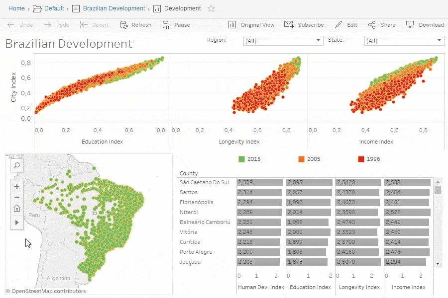
While Tableau certainly isn’t the most expensive tool, the cost of setting up the integrations and having an on-call IT department makes it a little pricey. Tableau is the perfect choice for a data-driven team with some proficiency in data analysis.
2. GoodData
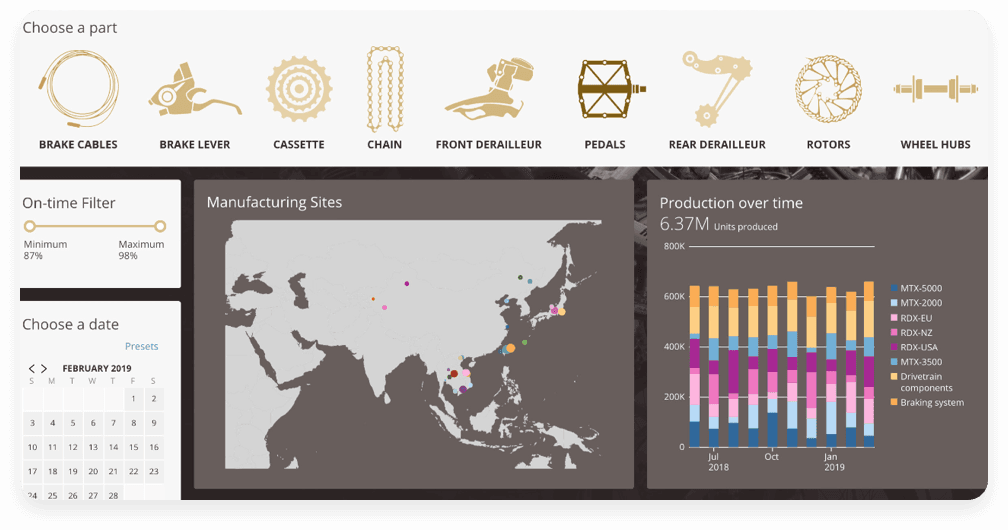
GoodData is the perfect choice for product teams wishing to embed analytics into their SaaS application. It lets you monetize your product data by enabling you to build a compelling analytical experience for your customers.
With the GoodData platform, teams can easily integrate reports, dashboards and insights directly into their product, at the point of work, using multiple tools, such as React based SDK. Moreover, thanks to the GoodData semantic model, that abstracts complicated data into a simple form, on top of the easy to use self-service interface, users with lower data literacy are empowered to create their own dashboards and reports from scratch, freeing up your team resources from custom requests.
With a straightforward pricing structure, (including a freemium tier) where you pay per workspace rather than per user, you can effectively roll out analytics to 10s, 100s or 1000s of customers without eating into your profit margins. Its robust scalability future-proofs your application’s longevity allowing timely updates to all, or select, users without the possibility of unexpected crashes or manual fixes.
3. Plotly
Do you feel ready to dive deep into your data? Plotly’s Dash platform is designed for data science teams who want to build analytic apps without relying on developers.
Similar to Tableau, it lets you create interactive, real-time visualizations, with custom dashboards that are easy to navigate. The UI is clean, responsive, and optimized for mobile platforms.
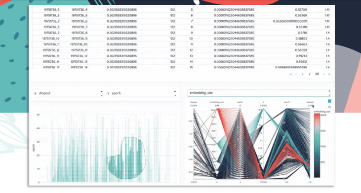
While you don’t need to know Javascript to use Plotly, some coding knowledge (Python), is required. If you’re willing to learn, you can use Dash Open Source to play around with a huge library of components and dashboards.
While certainly not the most beginner-friendly introduction to data visualization, it’s a fantastic for Product Managers with a background in data and and a solid understanding of Python.
4. MicroStrategy
A complete analytics platform that supports both data visualization and data mining, MicroStrategy can help when you need to think big. Featuring a drag-and-drop interface, teams can easily build data discovery dossiers.
If you don’t want, or don’t need, to spend a lot of time building custom visualizations, MicroStrategy comes with a huge library of ‘out-of-the-box’ charts, graphs, and maps. Just plug in your data and go!
The library has been cited by users as a great way to close the user experience gap, and make the platform accessible for all employees. Deployment is quick and easy, with great end-user training provided by MicroStrategy’s team.
There are also options for Python integration for users who have some coding experience.
5. Klipfolio
Another great choice for those new to data analysis, Klipfolio keeps things simple. Their PowerMetrics tool requires no coding, and requires no technical help from your dev team. Klipfolio is particularly popular with startups, non-profit organizations, eCommerce, and small businesses.
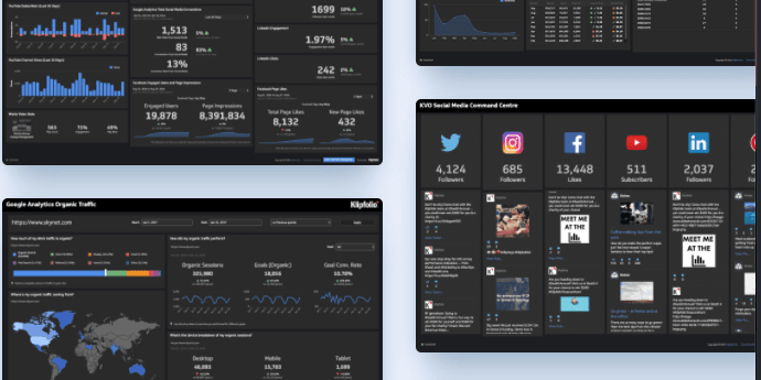
It’s also one of the cheapest tools on the market, making it the perfect choice for low-budget operations. Don’t think that the low price tag reflects low quality, as this platform is trusted by companies like Under Armour, BMW, Volvo, and Visa.
While this platform might lack some of the fancier, in-depth data visualization features, it’s the perfect choice for small teams and beginners.
6. QlikView / Qlik Sense
Perhaps suited to those more adept at data visualization/analysis, QlikView can be a little tricky to figure out. However, because it is so popular, there are plenty of online resources to help you pick it up. If you have the budget for it, they offer training courses to maximise your use of the platform.
It’s a relatively straightforward platform, and can handle both big and small data.
It’s also pretty budget-friendly, and if you’re willing to put the time in to learn, can be a great choice for a startup. Qlik now also offer Qlik Sense, which has a larger list of features, such as augmented intelligence and visual data prep. You can weigh up which would be better for you right here.
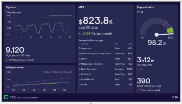
7. Geckoboard
Another platform which puts the emphasis on sharing, Geckoboard integrates with a range of everyday tools. This is a great choice for any product team who wants to work with data without always asking for help from developers.
If you often find yourself in meetings, or having to present to stakeholders, Geckoboard’s designs are made for big screens. Create your own, logical, custom layouts to only show the information you need in an easy-to-digest way.
This is a great choice for Product Managers with low tech/coding skills, who need to translate data for cross-functional, non-tech teams.
8. DataWrapper
No budget, no design skills, and no code skills? No worries! Datawrapper is a free tool (with premium upgrades available) that offers data visualization from the browser.
Embed live updating graphics, create mobile-responsive graphs, and use a beginner-friendly UI.
While Datawrapper is most popular with publications, it’s a great way to start experimenting with data visualization if you’re self-taught. Check out their training materials here.
9. Domo
Domo’s Business Cloud is a popular choice for analysts, and with agile teams who want to act fast. Domo puts the emphasis on speed and automation, allowing teams to get the information they need as quickly as possible.
You can set up customized alerts for when KPIs deviate from your threshold, and view your insights across multiple devices.
With no code skills needed, Domo is designed to be used by everyone in your team who needs to see your data. Not just data experts! It’s very user-friendly, and built to be shared across teams.
They also have an extensive resource library to keep you learning, and a free trial to let you test it out for yourself.
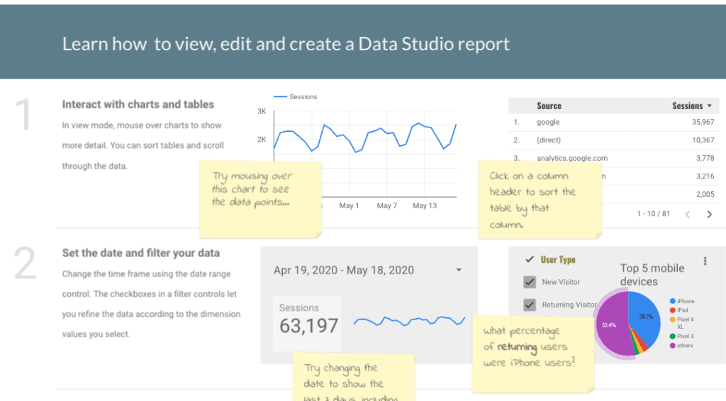
10. Google Data Studio
One of the main benefits of Google Data Studio, is that the UI follows the same theme and logic as the rest of the suite. If you’ve used Google Analytics, or Google Trends, the Data Studio will feel familiar. If you’ve even made anything in Slides, you’ll feel at home here. Any head start is a good head start!
As with most of Google’s services, Data Studio is completely free and largely flexible. It’s especially useful if you’re already using tools like Google Analytics, Ads, Search Console, and YouTube Analytics.
If you’re an aspiring Product Manager, and want to toy around with data visualization ahead of pursuing a career, this is a great playground.
Have any other data visualization platforms we should know about? Give them a shoutout on Twitter!
Programming Languages for Data Visualization
Python, R, and SAS can create awesome visualizations, and can be a great addition to any platform.
With programming languages, you can also make some very specific visualizations. On the other hand, the more complex the visualization, the more complex the programming! It’s both a time and effort-heavy endeavor and could be overkill if you’re only working with a small/medium amount of data.
If you’re looking to learn data visualization from scratch, and don’t know any programming languages, this will be the hardest path to follow. However, there are far more resources for learning programming languages than for any platform. So if you’re dedicated, Python, R, and SAS are great additions to your PM toolkit.
Many of the tools we listed come with no-code options, and you can ask your Data Scientist for help with the low-code options. There’s still no need to be a proficient programmer for data visualization, but it certainly helps! The same could be said for Product Management.
Now, you might be asking yourself “do I need to learn code to be a Product Manager?” We’ve got you covered!
Still looking for some great new tools? Check out Productverse, our one-stop shop for tools!
Updated: January 24, 2024