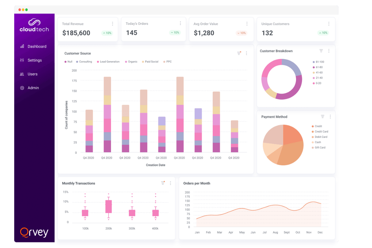
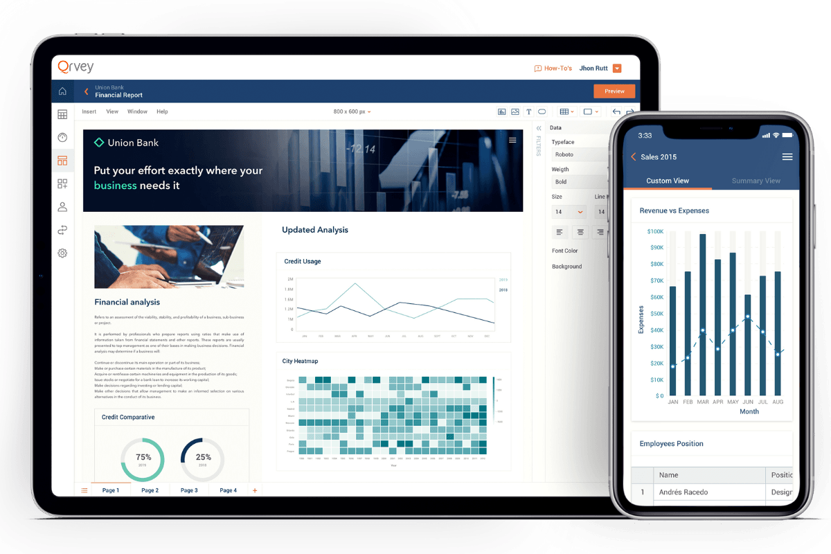
Data visualizations are a powerful tool for conveying information and insights in a visually appealing and easily understood way. They can help people with varying levels of comfortability with data better understand the full story.
In SaaS, data visualizations are only a part of the overall analytics experience, but they play a major role in helping your customers derive the insights they need to make business decisions. Creating captivating and engaging data visualizations is a great way to:
Increase product adoption
Create a highly engaging experience
Improve product stickiness
However, creating effective data visualizations within your SaaS product requires careful consideration and attention to best practices. If ignored, you run a great risk of low adoption rates.
In this article, we will explore five key best practices that can help you create data visualizations. We’ll help you choose options that are both visually appealing and effective in communicating your data story.
Important to note: Whether your company builds your SaaS analytics offering in-house or you integrate one of the best-embedded analytics tools in the market, product managers need to know these best practices to ensure customers are satisfied and happy with the reporting experience you provide.
See This Dashboard and Chart Builder in Action
Try these guided demos to see how easy it is to build white-labeled dashboards and charts.
Try Interactive Demos
1. Choose the Right Data Visualization Type
One of the first steps in creating an effective data visualization is to choose the best chart type for your data. The type of visualization you choose should depend on the nature of your data and the message you want to convey.
When it comes to data visualization, there are numerous options available, each with its own strengths and weaknesses. Understanding the characteristics of different visualization types can help you make an informed decision.
Categorical data
For example, pie charts are useful if you want to compare categories or show the proportions of different groups. A pie chart divides a circle into slices, with each slice representing a different category or group. The size of each slice corresponds to the proportion of that category or group in the whole. This type of visualization is particularly useful when you want to highlight the relative sizes of different categories.
Numerical data
On the other hand, if you want to compare numerical values across different categories, a bar graph might be more suitable. A bar graph uses rectangular bars to represent the values of different categories. The length of each bar corresponds to the value it represents. This type of visualization is effective in showing comparisons and trends.
Relationship data
If your goal is to show the relationship between two variables or display patterns over time, a line graph or scatter plot might be the way to go.
A line graph uses lines to connect data points, showing the progression of values, typically over time.
A scatter plot, on the other hand, uses individual data points to represent the relationship between two variables. This type of visualization is great for identifying correlations or trends. Experimenting with different data visualization types can help you find the most effective way to present your data.

2. Eliminate Clutter and Draw Attention to Relevant Data
When creating a data visualization, it is important to eliminate clutter and draw attention to the most relevant data. Too much information or unnecessary elements can distract the viewer and make it difficult to understand the main message of the visualization.
Eliminate visual clutter
To eliminate clutter, consider removing non-essential elements such as gridlines or unnecessary labels. Use color, size, or positioning to draw attention to the most important data points or trends. By doing so, you can guide the viewer’s attention to the key insights and ensure that your visualization is clear and focused.
One effective way to eliminate clutter is to simplify the design of your visualization. Instead of using complex charts or graphs, consider using simpler visual elements such as bar charts or line graphs. These types of visualizations are easier to read and understand, allowing the viewer to focus on the data itself.
Use whitespace
Another strategy to reduce clutter is to use whitespace effectively. Whitespace refers to the empty space around your visual elements. By strategically placing whitespace, you can create a sense of balance and organization in your visualization. This not only makes it visually appealing but also easier to navigate and interpret.
When it comes to drawing attention to relevant data, color can be a powerful tool. Use color strategically to highlight the most important data points or trends.
For example, you can use a bold or contrasting color for the key data points. Then use a more muted color for the less important ones.
This creates a visual hierarchy that guides the viewer’s attention and makes it easier to understand the main insights.

Size matters
Size is another attribute that draws attention to relevant data. By increasing the size of certain data points or elements, you can make them stand out from the rest of the visualization. This can be particularly effective when you want to emphasize a specific trend or outlier in the data.
Positioning for attention
Positioning is yet another way to draw attention to relevant data. By strategically placing important data points in prominent areas of the visualization, you can catch the viewer’s eye. An example would be the center or top of the chart. This can be especially useful when you have multiple data points or trends that you want to highlight simultaneously.
When creating a data visualization, it is crucial to eliminate clutter and draw attention to the most relevant data. By simplifying the design, using whitespace effectively, and strategically employing color, size, and positioning, you can ensure that your visualization is clear, focused, and impactful.
3. Make Effective Design Choices
The design choices you make when creating a data visualization can greatly impact its effectiveness. Consider factors such as color, font size, and layout to create a visually appealing and easy-to-understand visualization.
Color
When it comes to color, you want your color palette to allow for easy differentiation between different data categories.
For example, if you are creating a bar chart to represent sales data for different products. Try using a color palette with distinct colors for each product category to help viewers quickly identify data points.
Font size
Font size and style also play a crucial role in the readability of your visualization. Even if you have chosen a beautiful color palette, bad font sizing can ruin your visualization. Use a legible font size and style that is easily readable, even when the visualization itself is small.
Layout & arrangement
In addition to color and font choices, the layout of your visualization is equally important. A well-designed layout is intuitive and guides the viewer’s eye through the visualization in a logical manner. Consider the flow of information and the hierarchy of elements within your visualization.
For instance, if you are creating a line chart to show the growth of different industries over time, arrange the industries in a logical order. This along with clear labels can help viewers understand the progression easily.
By making effective design choices, you can enhance the visual impact of your data visualization. Remember to consider factors such as color, font size, and layout to make it visually appealing. And make it an easy-to-understand visualization that effectively communicates your data.
4. Label Chart Modules Appropriately
Properly labeling the various elements of your data visualization is essential for ensuring clarity and understanding. Each chart module or component should be clearly labeled with informative and concise labels.
For example, if you have a bar chart displaying sales data for different months, label each bar with the corresponding month.
By providing clear and informative labels, you can help the viewer understand the data and draw meaningful insights from the visualization.
Understandable Axis Labels
When labeling chart modules, it is important to consider the target audience and their level of familiarity with the subject matter.
If your data visualization is intended for a general audience, it may be helpful to provide additional context or explanations in the labels. This can help viewers who are not familiar with the data or the chart type to better understand the information being presented.
Furthermore, the placement of labels within the chart modules can also impact the overall clarity of the visualization. Labels should be positioned in a way that minimizes confusion and maximizes readability. For example, in a line chart showing the growth of different products over time, it may be more effective to place the labels directly above or below the data points instead of within the lines themselves.
Clear titles
In addition to labeling individual chart modules, it is also important to provide clear and concise titles. The title should accurately describe the main purpose of the visualization, allowing viewers to quickly grasp the topic.
Coloring
Another aspect to consider when labeling chart modules is the use of color. Color can be a powerful tool for highlighting important information or patterns within the data. However, it is important to ensure that the color choices do not hinder accessibility or confuse the viewer.
Labels should be easily readable against the background color of the chart module. Additionally, color-blind-friendly palettes should be used whenever possible.
Lastly, when labeling chart modules, it can be helpful to provide additional information in tooltips or captions. Tooltips are small pop-up boxes that appear when the viewer hovers over a specific element providing more detailed information.
Captions, on the other hand, are brief explanations that accompany the chart and provide context for the data.
5. Choose Appropriate Data Scaling
The choice of data scaling in your visualization can greatly impact how the data is perceived and understood. Consider the range and distribution of your data when choosing the appropriate scaling.
For example, if you have a dataset with a wide range of values, such as sales data, it might be more appropriate to use a logarithmic scale to avoid distortion. By choosing the right data scaling, you can ensure that your reporting choices accurately tell the story you want to tell.
Bonus: For Embedded Analytics, White Labeling Matters
Most of this advice applies to any type of analytics. However, the importance of white-label analytics is critical for embedded analytics within SaaS platforms.
One thing we’ve learned through the years is that not everyone has the skill set to create stunning data visualizations. This means as product leaders, guiding your customers to analytics success is critical. White labeling and using features like starter templates go a long way.
The best embedded analytics tools offer highly granular style controls and self-service analytics capabilities that can empower your customers to create their own reports. This will make your customers happy, as well as your engineering team since they will be spending less time building analytics.
See This Dashboard and Chart Builder in Action
Try these guided demos to see how easy it is to build white-labeled dashboards and charts.
Try Interactive Demos
Updated: January 22, 2025


